- Peak shift
- Perceptual Grouping and Binding
- Contrast
- Isolation
- Perceptual problem solving
- Symmetry
- Abhorrence of coincidence/generic viewpoint
- Repetition, rhythm and orderliness
- Balance
- Metaphor
Isolation
Ramachandran's first three principles, peak shift, grouping, and contrast, may, after a little thought, seem fairly obvious. Art is generally not meant to be strictly representational, but instead to highlight a particular viewpoint, or series of viewpoints, and amplify the features derived from those viewpoints. This is, in essence, the peak shift principle. In addition, artists are generally masters at guiding our visual attention, and the methods of grouping and contrast are exellent ways to do this. His third principle, however, may strike many as counterintuitive, but as he himself notes, it ultimately fits with a common artist's maxim: "Less is more."

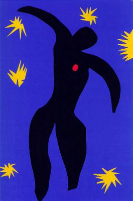
Henry Matisse, "Icarus (Jazz)."
The third principle, isolation, refers to "the need to isolate a single visual modality before you amplify the signal in that modality" (from RH). RH use the example of an outline drawing (or something similar, like the Matisse above), arguing that it is more aesthetically pleasing than a photograph, because it isolates one visual modality, in this case form (think also of a Robert Morris or Ellsworth Kelly sculpture, or other works by minimalists), which allows for the allocation of more attention to that modality. They write:
[T]here are obvious constraints on the allocation of attentional resources to different visual modules. Isolating a single area (such as ‘form’ or ‘depth’ in the case of caricature or Indian art) allows one to direct attention more effectively to this one source of information, thereby allowing you to notice the ‘enhancements’ introduced by the artist. (And that in turn would amplify the limbic activation and reinforcement produced by those enhancements).Presumably any visual modality (e.g., color, depth, luminance, etc.) could be isolated to produce a stronger aesthetic experience. A single work of art need not highlight only one modality, but the more attention we can allocate to any given modality, the more pleasurable the experience should be.
As evidence for this principle, Ramachandran (here and here) uses as examples stroke patients and an austistic child named Nadia who have damage to most areas of their brain, but whose right parietal lobes are largely intact. In stroke patients who fit this description, artistic abilities that they had not previously had often develop suddenly. Nadia is severely retarded, but she is capable of producing vivid drawings that are far more sophisticated and aesthetically pleasing than other children her age. Ramachandran argues that this is because one of the right parietal lobe's functions is artistic perception, and the ability to allocate all of one's attention to this area (due to the fact that so many other areas of the brain are damaged) allows these stroke patients and Nadia to produce exceptional works of art. In fact, autistic savants, even those whose brains are not as severely damaged as Nadia's, are often able to produce vidid works of art. RH argue that this is consistent with theories of autism in which the autistic mind tends to allocate all of its attentional resources to one channel, to the exclusion of others that may be relevant, as well as theories that argue that the lack of conceptual processing in autistics allows them to process visual information better.
The isolation principle is the one for which Ramachandran and Hirstein offer the most novel predictions, and therefore may be the easiest to test directly. Here are a few of those predictions:
If you put luminous dots on a person’s joints and film him or her walking in complete darkness, the complex motion trajectories of the dots are usually sufficient to evoke a compelling impression of a walking person—the so-called Johansson effect (Johansson, 1975). Indeed, it is often possible to tell the sex of the person by watching the gait. However, although these movies are often comical, they are not necessarily pleasing aesthetically. We would argue that this is because even though you have isolated a cue along a single dimension, i.e., motion, this isn’t really a caricature in motion space. To produce a work of art, you would need to subtract the female motion trajectories from the male and amplify the difference. Whether this would result in a pleasing work of kinetic art remains to be seen. (From RH)
[O]ne might predict that if you record from master ‘face cells’ in monkeys they might actually respond better to outline drawings than to half tone photos even though the latter have ‘more information’ (assuming that the masking by irrelevant attributes occurs earlier than the neuron’s response). The extra information is not part of the defining attribute of the face—only the outline is. Lastly if you obtain GSR (galvanic skin response) from humans or do non-invasive brain imaging you should see a bigger signal (either on the palm or in the fusiform brain area) for outline drawings of faces than would be the case with half tone photos— and an even bigger response if the drawing is also subjected to peak shift, caricature or exaggeration. (from Ramachandran's interview).I don't know that anyone has conducted such experiments (if they have, they haven't published them, which means they may not have worked), but the fact that Ramachandran is able to derive these predictions is indicative of the strength of the neuroaesthetic approach, and in keeping with its goals.
One more note on the principle of isolation. You may be thinking that it is similar to the peak shift principle. Recall that the peak shift principle involves the exaggeration of certain visual features. One way to strengthen the peak shift effect would be to isolate a single visual modality and exaggerate features in that modality, as, for example, the stick with three red lines isolates the color red from the chick's mother's beak, and then exaggerates them. One might argue that this is what Van Gogh has done with color in many of his later paintings, in which the entire form of the painting is defined by exaggerated color.

Vincent Van Gogh, "Cafe Terrace on the Place du Forum."
Perceptual Problem Solving
As I said in the previous post, Ramachandran argues that discovering a signal in noise is rewarding in itself. For this reason, we derive pleasure from extracting an image from a noisy background (recall the picture of the dalmation). In addition to doing this through grouping, we also use completion and other tools of the visual imagination. We combine elements, and search for ways to put sometimes disparate elements together. RH argue it is this that explains why a nude behind a veil is more appealing than an image of a woman nude in the open (or, to use Ramachandran's examples from the BBC lecture, " a full-colour Playboy photo or a Chippendale pinup"). We have to imagine the rest of his or her form, and in doing so, our visual system continually inputs to the limbic system, producing a continuous reward in order to keep us motivated. RH put it this way:
[A] puzzle picture (or one in which meaning is implied rather than explicit) may paradoxically be more alluring than one in which the message is obvious. There appears to be an element of ‘peekaboo’ in some types of art — thereby ensuring that the visual system ‘struggles’ for a solution and does not give up too easily.

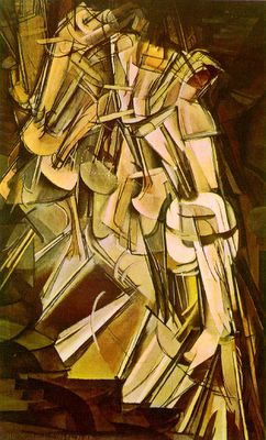
Marcel Duchamp, "Nude Descending a Staircase, No. 2."
This may explain the appeal of much of Picasso's work, or the work of the surrealists (e.g., the Duchamp painting above), in which the meaning or form is often elusive, forcing us to search for it. The search itself is rewarding, and thus part of what produces the aesthetic experience we get from such art.
Symmetry
It's well known that both facial1 and body2 symmetry are generally considered attractive, though the role of symmetry in attractiveness may not be as large as previously thought3.In fact, symmetry can give us a great deal of information about the environment, such as the presence of biological forms (which are usually symmetrical) and human-created artifacts. It's not surprising, then, that we find symmetry appealing in art. RH write:
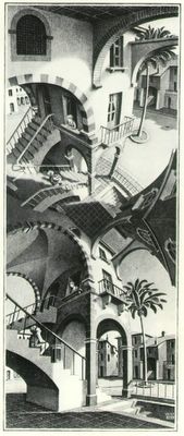
Since most biologically important objects — such as predator, prey or mate are symmetrical, it may serve as an early-warning system to grab our attention to facilitate further processing of the symmetrical entity until it is fully recognised. As such, this principle complements the other laws described in this essay; it is geared towards discovering ‘interesting’ object-like entities in the world.Thus, much as with grouping, contrast, and perceptual problem solving, art that uses symmetry (like the Escher drawing below) takes advantage of the fact that symmetry itself is rewarding in order to motivate us to allocate more resources to objects that exhibit it.

M.C. Escher "Up and Down."
Abhorrence of Coincidence/Generic Viewpoint
The human visual system is a Bayesian deduction machine. There are Bayesian models of virtually every aspect of lower and higher-level vision (if you don't believe me, go to any article database, and use the keywords Bayesian and vision). This means, among other things, that out of all of the possible interpretations of a particular visual input, the visual system will pick the most likely. This has two implications, which Ramachandran uses to formulate another principle of art: we prefer generic viewpoints, and we abhore coincidence. To understand the first part, the preference for generic viewpoints, consider the following two figures from RH:

As the caption notes, we automatically intepret Figure A as depicting one figure partially occluding another, instead of the two objects in B. This is because, while there are multiple viewpoints from which the image in A might be produced through occlusion, the objects in B could only produce it from one viewpoint.
The next two figures from RH help to illustrate the "abbhorence of coincidence":

In A, the palm tree's placement is suspiciously coincidental with the positioning of the pyramids, while B seems much more natural, with the palm and pyramids offset. Suspicious coincidences are suspicious because they are highly unlikely, and therefore our visual system tends not to like them. Thus, they and unique viewpoints are less rewarding.
This is one principle about which RH are quick to note that there may be violations that are appealing, perhaps because they utilize one of the other principles. For instance, the Picasso paintings discussed as examples of the peak shift principle in art, which utilize multiple viewpoints at one, produce several suspicious coincidences, and highly unique viewpoints, but their utilization of peak shift, and perhaps other principles like isolation or perceptual problem solving, makes them pleasing.
Metaphor
While Ramachandran lists metaphor as a principle of art on all of his lists, he doesn't really explain any neurological reasons for including it. He and Hirstein write:
Whether [metaphor] is purely a device for effective communication, or a basic cognitive mechanism for encoding the world more economically, remains to be seen. The latter hypothesis may well be correct. There are many paintings that instantly evoke an emotional response long before the metaphor is made explicit by an art critic. This suggests that the metaphor is effective even before one is conscious of it, implying that it might be a basic principle for achieving economy of coding rather than a rhetorical device.I, however, think there are good reasons for including this as a principle of art that is based on fundamental cognitive principles. Therefore, everything I'm going to say here about metaphor is my own, and you should not blame Ramachandran for it.
Much like the visual system is designed to notice groupings, contrasts, and to be excited by exaggeration, our cognitive system is designed, at all levels (including the perceptual) to notice connections between inputs. You might say that we have "analogical minds." It's likely that in order to facilitate the search for such connections, finding them is itself rewarding, and thus may contribute to the pleasureable experience that many visual metaphors elicit. However, metaphor and analogy (of which metaphor is likely a special case) also allow the artist to activate a wide range of images, concepts, and experiences, sometimes vivid ones, which carry with them their own affective appeal. There is evidence, for instance, that poetry using vivid perceptual metaphors is more appealing than poetry using less vivid metaphors. One of RH's examples illustrates this well. They write:
This is also true of poetic metaphors, as when Shakespeare says of Juliet, ‘Death, that has sucked the honey of thy breath’: the phrase is incredibly powerful well before one becomes consciously aware of the hidden analogy between the ‘sting of death’ and the bee’s sting and the subtle sexual connotationsof ‘sucking’ and ‘breath’."Sucking" and "honey" are vivid perceptual images, and when combined with the strong emotions elicited by the concept of death, they produce a very intense experience in the context of Shakespeare's story. Consider also Archibald MacLeish's description of poetry, in which he uses the following metaphor:
Silent as the sleeve-worn stoneThe image itself is vivid (not simply of a stone, but one that is worn by the sleeves of many arms resting upon it), and allows MacLeish to say much more about poetry than he actually says. In a sense, then, the work of art, through metaphor, is less a statement with its own meanings, but a sign that points to many meanings, and their associated affects, which thus allows the work to produce a more powerful aesthetic experience. As MacLeish wrote:
Of casement ledges where the moss has grown--
A poem should not mean1 Perrett, D.I., Burt, D.M., Penton-Voak, I.S., Lee, K.J., Rowland, D.A. & Edwards R. (1999). Symmetry and human facial attractiveness. Evolution and Human Behavior, 20, 295-307.
But be.
2 Tovée, M.J., Tasker, K., & Benson, P.J. (2000). Is symmetry a visual cue to attractiveness in the human female body? Evolution and Human Behavior, 21, 191-200.
3 Thornhill, R., & Gangestad, S. W. (1999). Facial attractiveness. Trends in Cognitive Sciences, 3(12), 452-460.
4 comments:
THANK you. Man, it was REALLY HARD to track down an explanation of Ramachandran's abhorrence of coincidence and isolation rules.
I'll be reading you from now on. :)
A really fascinating discussion of the connection between art and psychology.
Your blog is very wonderful, and I like it very much. And welcome to my blog. We have the same opinions on something.
Do you know the famous polo cotton shirt? Do you want to be a fashion chaser? Follow me and you can chase the most popular spyder. it can help you increase your attraction.
My friends and I also want to buy excellent babolat tennis, and I know there is a perfect store recently, which sells perfect tennis classic.In order to play the game and search the place where can buy the wilson tennis racquet, we find many places, and finally, we find babolat tennis equipment.
would you want to be more attractive? If your answer is "Yes", you can wear spyder wear, you really need a pair of polo waterproof jacket
. They can make you become the focus.
prince tennis accessories
discount tennis racquets
wilson tennis racquets
head racquets
babolat racquets
wilson racquet
women's polo hoodies
men's polo shirts
spyder jacket
women's jacket
ralph lauren t shirt
polo women shirts
black polo
spyder ski
The cold winter, does not seem too for wedding. Most recently, the cold one after another,
hangzhou air temperature pelter, let many wedding in late November bride is due a single wear
gauze or dress, will feel cold, wear too much and feel very bloated. For the bride, the winter is
the biggest test how wedding in temperature and balance between poise.
Don't be too upset, actually this season only fees cheap Wedding Dresses, marriage can create a different
character "winter wedding", also more memorable.
You can use the glittering and translucent white fairy tale, cheap cell phones
,the artistic conception to dress up oneself's wedding, choose blue, green, white ice cold tonal,
decorous atmosphere to create beautiful, Can borrow snow machine and bubble machine build indoor
romantic atmosphere, snowflake, feathers, Christmas tree,cheap cocktail
dresses, even is the element such as silver crystal, can add to your winter wedding dreamy
colour, cheap
jewelryyou can even in a pile of snowman YingBinChu lovely, guests, we must take it and will
soon be well.
On New Year's hottest r306c SONY Ericssoncheap cell phones
wholesale, r306 first win in shape, give a person the feeling of professional and heavy. Its
design clamshell has hidden qualities. Although the low-end market positioning, introduction, SONY
Ericsson R series launched two must let those radio enthusiasts. And there are cheap ones, let the
public mobile phonewholesale of delight
The word "shanzhai" is very popular in China. It is industry phenomenon of imitation, high quality
and low price. Moreover, cell phones are the
representative of them.The global financial crisis led to a significant shri10:25 2009-12-26 nkage
of assets for people. "china wholesale" demonstrate the
might. most of them would like buy the cheap cell phonesnow .
Through google search engine, when you put in "discount cell
phones", you will find more than 15,000 pieces of related information.Cell phone china has been
concerned in the world. Many
international sellers can get a considerable profit by ways of wholesale cell phones from China
and switch selling. So it is a very
good job on cell phones wholesale in the current cosplay costumes
financial crisis.
Wholesale Polo Shirts
Ralph Lauren Polo Shirts
Discount Ralph Lauren Polos
Post a Comment