- Peak shift
- Perceptual Grouping and Binding
- Contrast
- Isolation
- Perceptual problem solving
- Symmetry
- Abhorrence of coincidence/generic viewpoint
- Repetition, rhythm and orderliness
- Balance
- Metaphor
Peak Shift
The concept of peak shift is probably familiar to some of you. First demonstrated in pigeons1, the peak shift effect occurs when an animal is rewarded for responding to a particular stimulus (the S+ stimulus, for positive stimulus), and not rewarded for responding to another (S-, for negative stimulus). After the training phase, the animal is tested with a range of stimuli to test for generalization. The animal will, of course, respond to S+, and not respond to S-, but surprisingly, the animal will respond the most to stimuli that are further from S- on the dimension(s) on which S+ and S- differ. For example, if pigeons are rewarded for responding to a flash of light of a particular wavelength (e.g., S+ = 550 nm), and not rewarded for responding to wavelengths higher than S+, then during the testing phase, they will respond the most vigorously to wavelengths under S+, with the size of the response increasing as the wavelength decreases. For another example (from Ramachandran and Hirstein) that might make the role of peak shift in art more clear, consider rats that are trained to respond to rectangles, and not to squares. Since rectangles and squares differ on a single dimension (e.g., width or height), then rats trained to respond to a rectangle of a certain length will respond more vigorously to rectangles of even greated width (or height, depending on the original stimulus).
Ramachandran and Hirstein (RH) compare the peak shift effect to the Sanskrit word "rasa," which is loosely translated as "essence." The peak shift involves the extraction of the "rasa" of a particular shape, color, etc. For example, consider the Hindu sculpture below. RH argue that the artist has abstracted the female body shape, and exaggerated it in a direction that takes it away from the male body shape, thus making the sculpture more aesthetically pleasing.

From Ramachandran's BBC Lectures, Lecture 4.
This explanation actually fits nicely with research on face and body attractiveness. There researchers have found that in some contexts (e.g., during periods of high fertility), women find artificially produced faces with exaggerated masculine features more attractive than normal or "average" faces (usually eigen-faces)2. In addition, participants find exaggerated female or male bodies more attractive than the real bodies rated most attractive, and exaggerated female bodies with male features, or male bodies with female features, are rated as the least attractive (see this PPT presentation).
Another example that RH use to illustrate the peak shift effect in art is the work of François Boucher, and his nudes in particular (see the painting below). RH argue that Boucher exaggerates the rosey hue in the womens' skin color, making them more attractive than figures with normal hues. They write:
[T]he primate brain has specialized modules concerned with other visual modalities such as colour depth and motion. Perhaps the artist can generate caricatures by exploiting the peak shift effect along dimensions other than form space, e.g., in ‘colour space’ or ‘motion space’. For instance consider the striking examples of the plump, cherub-faced nudes that Boucher is so famous for. Apart from emphasizing feminine, neotonous babylike features (a peak shift in the masculine/feminine facial features domain) notice how the skin tones are exaggerated to produce an unrealistic and absurd ‘healthy’ pink flush. In doing this, one could argue he is producing a caricature in colour space,particularly the colours pertaining to male/female differences in skin tone.

François Boucher, "Nude on a Sofa"
The Hindu scuplture and Boucher painting illustrate examples of exaggeration, or peak shift, that are easily identifiable. However, it may not always be possible to identify what is being exaggerated in art. This is not a problem for the theory, however. RH mention the example of seagull chicks, which instinctively peck at their mother's beak, which has a bright red spot at the tip. Researchers have shown that seagull chicks will also peck at a stick with a red dot at the end. Suprisingly, they will peck the most (when compared to the mother's beak and the stick with the red dot) at a stick with three red stripes. This stick bears no resemblance to their mother's beak, but the exaggeration of the relevant features (the red) produces an extreme response. RH call this last stick an "exaggeration in beak space," and argue that it is a "super-stimulus" that is the seagull equivalent of a Picasso. Concerning the human version of a Picasso, then, Ramachandran believes that Picasso's combination of two views of one face in a painting serve as a similar super-stimulus. In an interview, Ramachandran put it this way:
When a convergence of axons from several ‘regular’ face cells occurs on a single master cell, nature (or evolution) is not going to go through all the trouble of ensuring that the convergence results in a perfect ‘OR-gate’. On the contrary it may well be that if both views are simultaneously presented to the master cell then the converging inputs from the two corresponding regular ‘single view’ cells may simply add linearly — until saturation. This means you would be hyperactivating the master neuron in a manner that could never occur in nature (Ramachandran, 2000a,b). So this master face neuron may scream out loud (so to speak)‘WOW—what a face! and excite the limbic system correspondingly. Now the advantage with this explanation is that it can be tested experimentally.Finally, the peak shift principle may also help to explain the relationship between a particular artist and her influences. RH write:
Neuroscientists at Oxford and Princeton are currently recording from both types of cells in these very areas. My prediction is that if you find a regular face cell, it should get excited by regular faces but not any more so by a Picasso face (since only one of the views will excite the cell). But if you go to the master cell, where convergence of many views occurs, then that cell will not only respond to any individual view but even better to two views presented simultaneously as in a cubist portrait!
Often paintings contain homages to earlier artists and this concept of homage fits what we have said about caricature: the later artist makes a caricature of his acknowledged predecessor, but a loving one, rather than the ridiculing practised by the editorial cartoonist. Perhaps some movements in the history of art can be understood as driven by a logic of peak shift: the new art form finds and amplifies the essence of a previous one (sometimes many years previous, in the case of Picasso and African art).Grouping
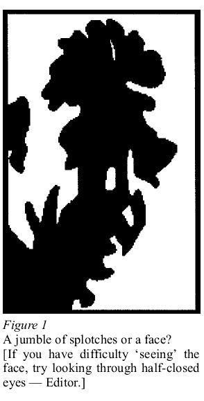
The early parts of our visual system are designed, in large part, to detect signals in a world of noise. RH argue that discovering correlated features in the visual field, and binding those features, must be rewarding, in order to ensure that we continue to do so despite the difficult. The rewarding nature of this is illustrated in the "AHA" sensation that we often get when we discover a figure among a noisy background. After discovering this figure, we are unable not to notice it again (think of the man, or rabbit, in the moon). To illustrate this, RH provide two figures, which I've given below. In the first, random splotches turn into a face as we bind the features together. In the second, the same processes discover a dalmation. They argue that the discovery of such groupings on different perceptual dimensions (they list space, colour, depth, and motion) are individually reinforcing because it is adaptive to keep such discoveries from individual perceptual modules in memory for later processing. Thus, the presence of groupings on various perceptual dimensions in art should produce an aesthetically pleasing experience.

For examples of this principle from art, consider the following painting by Paul Klee:
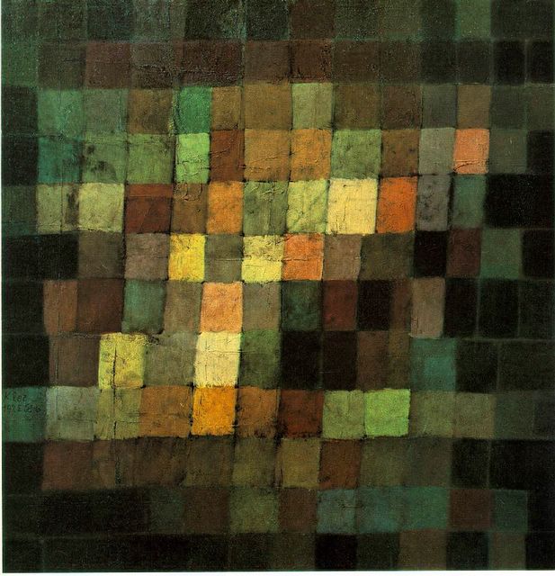
Paul Klee, "Ancient Sound, Abstract on Black"
It is impossible not to see the bright squares as a group in contrast to the darker squares that form its background. According to RH, this grouping on the brightness dimension should cause the relevant module in the visual system to send a signal straight to the limbic system, which then causes a pleasant sensation, producing the aesthetic experience that we get from the painting.
Contrast
The Klee painting also helps to illustrate another of Ramachandran's principles, contrast. RH write:
Cells in the retina, lateral geniculate body (a relay station in the brain) and in the visual cortex respond mainly to edges (step changes in luminance) but not to homogeneous surface colours; so a line drawing or cartoon stimulates these cells as effectively as a ‘half tone’ photograph. What is frequently overlooked though is that such contrast extractions — as with grouping — may be intrinsically pleasing to the eye (hence the efficacy of line drawings). Again, though, if contrast is extracted autonomously by cells in the very earliest stages of processing, why should the process be rewarding in itself? We suggest that the answer... has to do with the allocation of attention. Information (in the Shannon sense) exists mainly in regions of change—e.g. edges—and it makes sense that such regions would, therefore, be more attention grabbing — more ‘interesting’ — than homogeneous areas. So it may not be coincidental that what the cells find interesting is also what the organism as a whole finds interesting and perhaps in some circumstances ‘interesting’ translates into ‘pleasing’.In the Klee painting, the contrasts make the painting. In this case, the groupings that are pleasing are created by the perception of edges between squares of different levels of brightness (for more examples, see these two paintings). Brightness need not be the only dimension on which we find contrast pleasing, however. Color, for instance, is often used to form striking contrasts (see, for example, these two paintings by Matisse).
While these examples, and the primary motivation for this principle, come from our knowledge of the early visual system, RH also give one example of the use of contrast that may utilize higher-order visual processes. They write:
A nude wearing baroque (antique) gold jewellery (and nothing else) is aesthetically much more pleasing than a completely nude woman or one wearing both jewellery and clothes, presumably because the homogeneity and smoothness of the naked skin contrasts sharply with the ornateness and rich texture of the jewellery.They admit that this example may bear only a figurative resemblance to contrasts on early visual dimensions like color and brightness, but the use of such examples may lead to interesting predictions about the use of higher-order contrasts in art, and their role in the aesthetic experience. If these higher-order contrasts turn out to be aesthetically pleasing for reasons similar to those of the lower-order contrasts, then we may find that contrast itself is one of the most pervasive principles in art.
That's probably enough for one post. In the next post, I'll discuss the remaining principles. Feel free to comment on these before I get to the rest.
UPDATE: The third post in the series is here.
1 Hanson, H. M. (1959). Effects of discrimination training on stimulus generalization. Journal of Experimental Psychology, 58, 321-334.
2 Thornhill, R., & Gangestad, S. W. (1999). Facial attractiveness. Trends in Cognitive Sciences, 3(12), 452-460.
13 comments:
Very cool and very interesting. I'd like to see more evidence on the possible links between higher-order contrasts in art and the basic principle on the cellular level, because, as you say, that seems to me to be the weak spot, but of course that's the trickest area to establish.
I'm looking forward to the next set of principles.
Posted by Claire Bickell
Fascinating insight on the relation of maths, evolution and the arts. Really thought provoking, im getting back to my sketch book :)
Thanks for providing this really useful info
http://www.shoesbuying.com/ : 2009 nike shoes
http://www.shoesbuying.com/2009-nike-shoes-c-153.htm : new nike shoes
http://www.shoesbuying.com/air-max-classic-bw-c-185.htm : Women's max
http://www.shoesbuying.com/mens-max-93-c-188.htm : Men's max 93
http://www.shoesbuying.com/nike-shox-c-165.htm : nike shox
http://www.shoesbuying.com/nike-force-c-174.htm : Nike air force
http://www.shoesbuying.com/nike-2003-c-181.htm : Nike air max 2003
http://www.shoesbuying.com/nike-air-max-ltd-c-166.htm : nike air max ltd
http://www.shoesbuying.com/nike-air-max-tn-c-167.htm : nike air max tn
http://www.shoesbuying.com/nike-rift-shoes-c-162.htm : Nike air rift
http://www.shoesbuying.com/nike-yeezy-c-184.htm : Nike air Yeezy
http://www.shoesbuying.com/nike-airmax-c-154.htm : nike airmax
http://www.shoesbuying.com/nike-airmax-c-155.htm : Nike air max 90
http://www.shoesbuying.com/nike-airmax-c-157.htm : Nike air max 97
http://www.shoesbuying.com/nike-birds-nest-shoes-c-152.htm : nike birds nest shoes
http://www.shoesbuying.com/nike-dunk-high-c-177.htm : nike dunk
http://www.shoesbuying.com/nike-shoes-c-168.htm : nike RT1 shoes
http://www.shoesbuying.com/nike-sb-c-180.htm : nike SB
http://www.shoesbuying.com/nike-shox-shoes-c-156.htm : nike shox shoes
http://www.shoesbuying.com/nike-shox-shoes-c-158.htm : Nike shox OZ shoes
http://www.shoesbuying.com/nike-shox-shoes-c-159.htm : Nike shox R2 shoes
http://www.shoesbuying.com/nike-shox-shoes-c-160.htm : Nike shox R3 shoes
http://www.shoesbuying.com/nike-shox-shoes-c-163.htm : Nike shox R4 shoes
http://www.shoesbuying.com/nike-shox-shoes-c-164.htm : Nike shox R5 shoes
http://www.shoesbuying.com/nike-shox-c-171.htm : Nike shox TL3
http://www.shoesbuying.com/nike-trainers-lovers-c-118.htm : nike trainers lovers
http://www.racketsoffer.com/ : tennis rackets
http://www.racketsoffer.com/wilson-racquets-c-19/ : Wilson tennis rackets
http://www.racketsoffer.com/head-racquets-c-18/ : HEAD tennis rackets
http://www.racketsoffer.com/babolat-racquets-c-17/ : Babolat tennis rackets
I agree and enjoyed reading, I will make sure and bookmark this page and be back to follow you more.
I agree and enjoyed reading, I will make sure and bookmark this page and be back to follow you more.
Very cool and very interesting. I'd like to see more evidence on the possible links between higher-order contrasts in art and the basic principle on the cellular level
Thanks for your post , it is very nice and helpful . all our products are top quality and low prices . would you like something ? ok follow me ! better choice better life !
NFL Jerseys
tn chaussures
Thanks for sharing . great article . all our products are top quality and low prices .
would you like something to buy ? for example clothes and shoes . ok ! follow me !
chaussures puma
Tn Requin
Cheap Polo Shirts
better choice better life !Thanks for your post , it is very nice and helpful .
Your article is very awesome. Do you know something new about NFL Jerseys? Our Chaussure de Sport is a good store provide you high quality Nike shoes. clothing jeans are very popular among fashion girls and boys. athletic shoes can perfectly match with it. ed hardy clothing is also very popular in recent years, Chaussures Sports will lead you a fashion life. Nike shoes like nike tn,tn requin,Tn Requin and Air Shoes are very popular among young fashion girls and boys. China Wholesale are also very cheap but functional. We also provide you top quality Tennis Racquet Shop,Cheap Nike Shoes, cheap nike shox,ed hardy, Nike Chaussures ,cheap polo shirts,Polo Shirts at a reasonable prices and awesome services.
cheap nike shox
cheap sport shoes
nike tn dollar
ed hardy ugg boots
ed hardy love kills slowly
ed hardy clothing us
ed hardy clothing
cheap ed hardy
cheap ed hardy clothing
ed hardy clothes
ed hardy wholesale
ed hardy clothing
ed hardy t shirts
ed hardy shirts
ed hardy uk
ed hardy t shirts
ed hardy shirts
ed hardy hoodies
Cheap JORDAN SHOES,,
cheap nike max ,。
puma future cat
ed hardy ugg boots.
ed hardy love kills slowly boots.
ed hardy love kills slowly.
ed hardy polo shirts.
cheap ed hardy clothing,.
ed hardy shirts .
ed hardy t shirts.,.
thanks for the post,a nice work.and be keeping eyes on it.
Air Max Chaussures
Air Max Chaussures
Air Max 1 Chaussures
Air Max light chaussures
Air Max 90 chaussures
Air 180 chaussures
Air classic BW chaussures
Air max 93 chaussures
Air max 95 chaussures
Air max 97 chaussures
ED Hardy
Air max 360 chaussures
Air Max Schuhe
Air Max 2009 Schuhe
Air max ltd chaussures
Air max tn chaussures
ugg boots
polo boots
polo shoes
herve leger
herve leger bandage dress
chanel outlet
chanel bandbags
chanel bags
chanel iman
ralph Lauren polo
ralph lauren outlet
lacoste polo
polo raplh lauren
air jordan 2010
cheap jordan shoes
jordan ajf shoes
discount jordan shoes
jumpman23
moncler
moncler jackets
moncler coats
moncler vest
moncler outlet
moncler Polo t shirt
cheap five finger shoes
kiss ghd
What an inspiring article you wrote! I totally like the useful glasses info shared in the article.
We share the opinion on eyewear and I really enjoy reading your article.
Good job for writing this brilliant article of eyeglasses online.
This is the best cheap eyeglasses article I have ever found on the Internet.
I totally agree with you on the point of prescription glasses. This is a nice article for sure.
Great resources of cheap kids glasses! Thank you for sharing this with us.
This child eyeglasses article is definitely eye-opening and inspiring.
I really like this children eyeglasses article, and hope there can be more great resources like this.
Excellent point here. I wish there are more and more kids sunglasses articles like that.
I greatly benefit from your articles every time I read one. Thanks for the unisex glasses info, it helps a lot.
I like your ideas about metal eyeglasses and I hope in the future there can be more bright articles like this from you.
You have given us some interesting points on plastic eyewear. This is a wonderful article and surely worth reading.
It has been long before I can find some useful articles about titanium eyewear. Your views truly open my mind.
Thank you so much for sharing some great ideas of aviator eyeglasses with us, they are helpful.
I am glad to read some fantastic rimless glasses article like this.
What an inspiring article you wrote! I totally like the useful nds card info shared in the article.
Excellent point here. I wish there are more and more nintendo ds articles like that.
Great article, it's helpful to me, and I also like the useful info about ez flash vi.
I greatly benefit from your articles every time I read one. Thanks for the dstti card info, it helps a lot.
Thank you so much for sharing some great ideas of dstt card with us, they are helpful.
I really like this m3 dsi article, and hope there can be more great resources like this.
I totally agree with you on the point of r4. This is a nice article for sure.
I appreciate your bright ideas in this r4 dsi article. Great work!
You have given us some interesting points on r4 sdhc. This is a wonderful article and surely worth reading.
Your do have some unique ideas here and I expect more ak2i cards articles from you.
Great resources of acekard 2i! Thank you for sharing this with us.
I like your ideas about nintendo ds card and I hope in the future there can be more bright articles like this from you.
Good job for writing this brilliant article of M3 Adapter.
Everyone has unique requirements in terms of brands,personal specifications and choices.Whether you
want to clothing online,new moncler,moncler jackets,moncler coats,moncler outlet,moncler vest,moncler polot-shirt,spyder outlet,spyder polot-shirt,spyder vest,spyder
coats,cheap ed hardy
wholesale,ed hardy wholesale,discount ed hardy wholesale,wholesale ed hardy,ed hardy outletyou can just take your pick, put it
in the shopping cart and make your payment.FromSexy
Lingerie Store,Intimate Apparel,Sexy Halloween Costumes,Sexy Underwear,cheap vibram 5 fingers, discount vibram five fingers,Vibram running shoes,vibram five fingers shoes,vibram five finger outlet ,you get them all here.
The real benefit is in the discount prices.
Post a Comment